 |
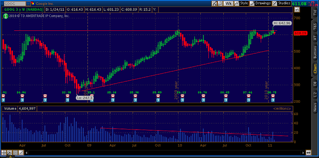
| Google weekly chart.. notice volume and trend divergence |
To be honest i do not really care about moving averages when looking at this chart because the volume and price action tells the story.. we have declining volume and a rising trend, with higher volume on
selling candles which are easily seen with Heikin Ashi candles. Today's clear rejection of primary broker dollars which most other beta tech ate up; such as apple gave me a few signals. The signals were there is a clear seller and Eric's exit package and quick exit is not something long term share holders were to fond of. The billion dollar question is, will 600 hold?
Or will 642.96 be taken out on the upside as buy programs push this market over 1300 like a plow through mud? It it not up to us, it is up to "them".. trade what you see...


